While we all recognise how important interior design is when communicating our sense of style and expressing our personality, the choice and placement of wall art is possibly the most personal statement we can make. Visitors are magnetically drawn to these windows to our past and interpretations of our world.
But wall art isn’t just a matter of placing an aesthetically appealing item on each surface. In 2016 we’re going far beyond the basics to create beautiful feature walls with starkly different elements. In this handy guide, Designbx experts show you the tricks of the trade and ensure your wall art enhances your interior design.
Complimenting your space
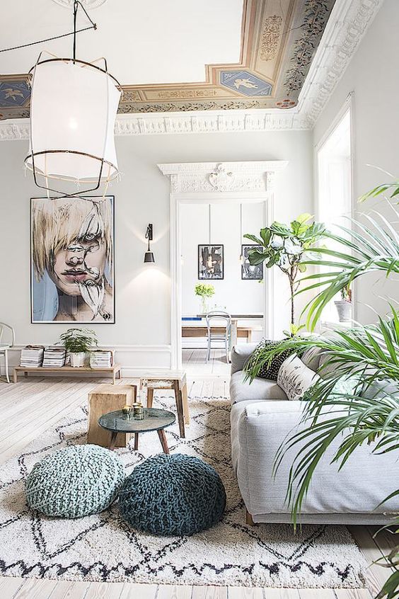
Art is subjective and personal, which means your choices are bound to make a statement, but make sure that statement doesn’t argue with your space’s style. You don’t have to be too strict, but when a canvas catches your eye, ensure you imagine the design of your room. An elaborate splash of colour could enhance your Boho living room but completely contradict the feel of your Industrial home office. Create a happy marriage between your wall art and style.
Canvas
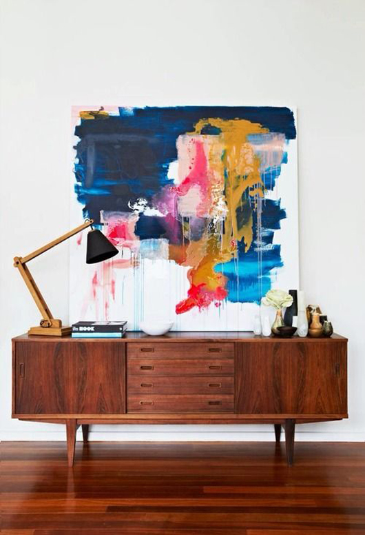
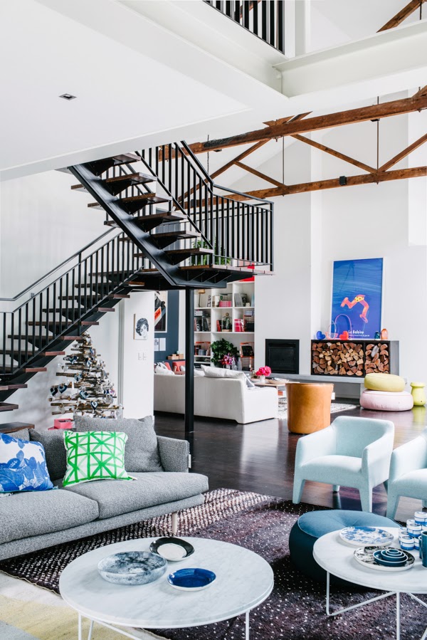
Think big with canvas! This is a great way to make broad, sweeping statements using colours and shapes that compliment your décor. Use large blocks of colour and abstract shapes to highlight your existing palette. Rather than a focal point that draws the eye with detail, this technique is more of an integral part of your interior design, like another layer of your expression. If you really want to take this approach to extremes, consider literally using materials from furnishings, covers, curtains or rugs and getting a professional to stretch the materials, ready to mount on your walls and create an undeniable wow factor.
Prints
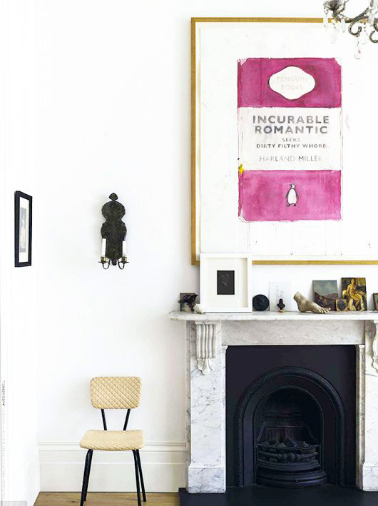
It may be a little beyond our budget to add an original Monet to our Modern Eclectic dining room or priceless watercolour to our Scandi sitting room, so prints are a popular and well accepted way to add a true artistic flavour to our spaces. In stark contrast to the bold use of canvas and materials, a deft touch and apt choice of print can create a more eye-catching statement while still seamlessly adding to your design choice. Even when the art is well known, and obviously not an original (most of us don’t have a spare $151 million for a Pollack or Picasso) our love of art still makes a huge statement about our personality.
Mirrors
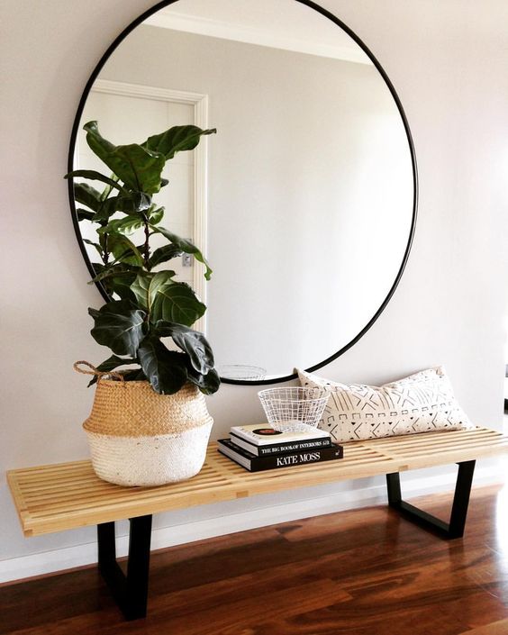
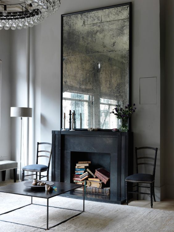
Mirrors are one of the big game changers in modern interior design, reaching far beyond their practical use to become art. Never underestimate the power of a mirror. It brightens a room by reflecting natural light and adds the illusion of extra dimensions, opening up the space. Often being more cost effective than artwork, you can go oversized without breaking the budget. Mirrors now come in varied shapes and coloured glass so they become interesting pieces of puzzles that join to make artworks of a new kind.
Vintage posters
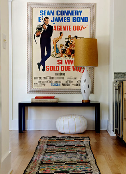
There was a time when most posters were originals, and nearly as hard to come by as original paintings. Thanks to the convenience of the interweb, you can reproduce some of the most exhilarating images designed throughout history, and in large formats that are bound to dazzle your visitors. Best of all, iconic posters express our personal loves, from film noir and classic concerts to exotic locations and retro advertisements.
Wood carvings and hanging textiles
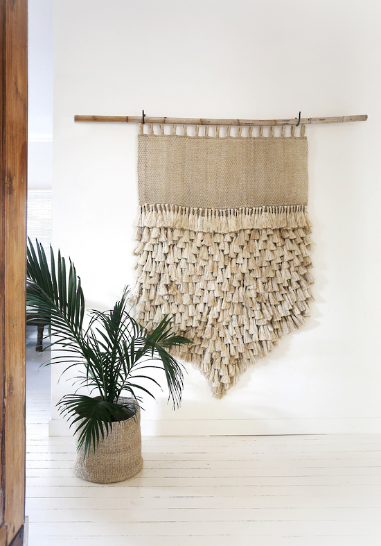
It’s not always about colours and shapes. Texture is just as powerful as the more obvious visual elements, especially when you’ve chosen interior design styles that rely heavily on layering of textiles, providing a feel rather than a look. Wood carvings and hangings are great solutions for homes that want less colour and punch but are after warmth. Boho and Scandi lovers are often drawn to these options.
Neon signs
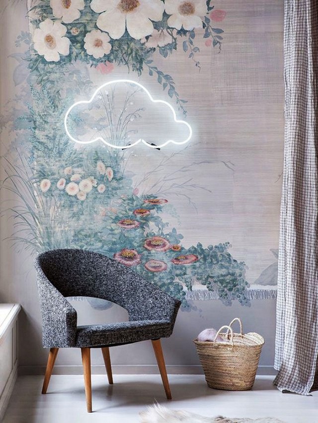
This is definitely a growing trend in interior design, and can include the humble retro sign (unfortunately not so humble in price), or custom-made signs that fit perfectly with your style and colour scheme. Be on the lookout at garage sales or invest in a piece by a recognised artist in the neon sign world, like Tracey Emin. Remember to carefully consider the relationship between the neon sign (often a central feature) and surrounding artwork.
Colouring in
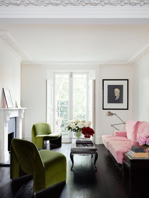
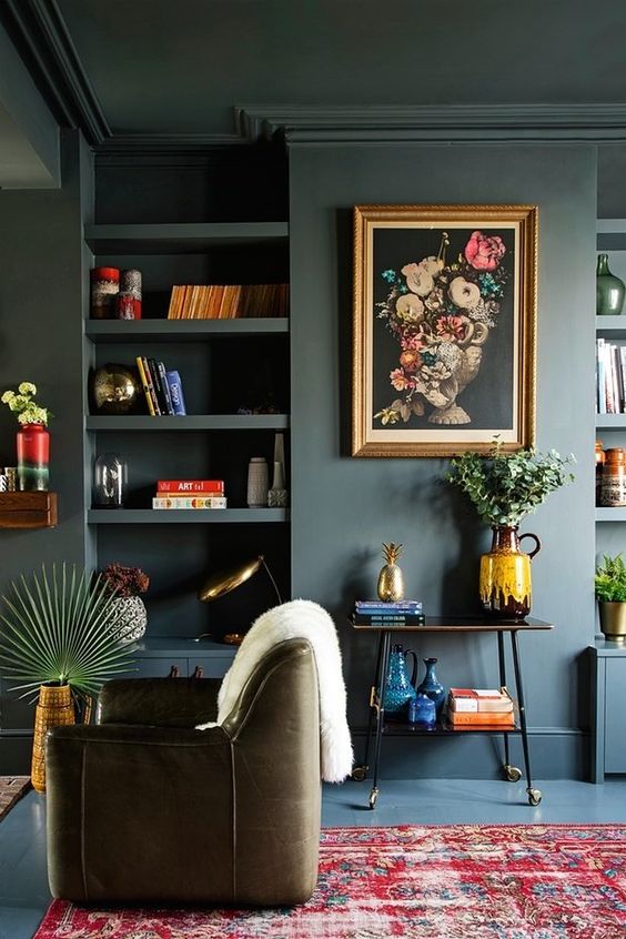
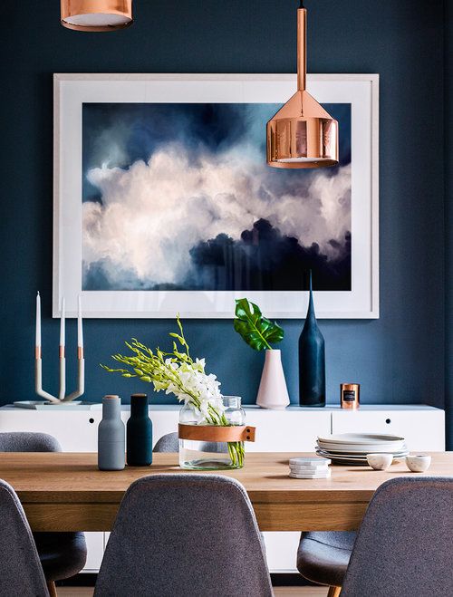
Give your wonderfully subdued palette a voice and personality by matching the tone of your room with artworks that harness your well-applied mood. Using deep blues and velvet? Match that sultry and refined look by choosing similarly moody artworks that enhance the atmosphere.
Eclectic
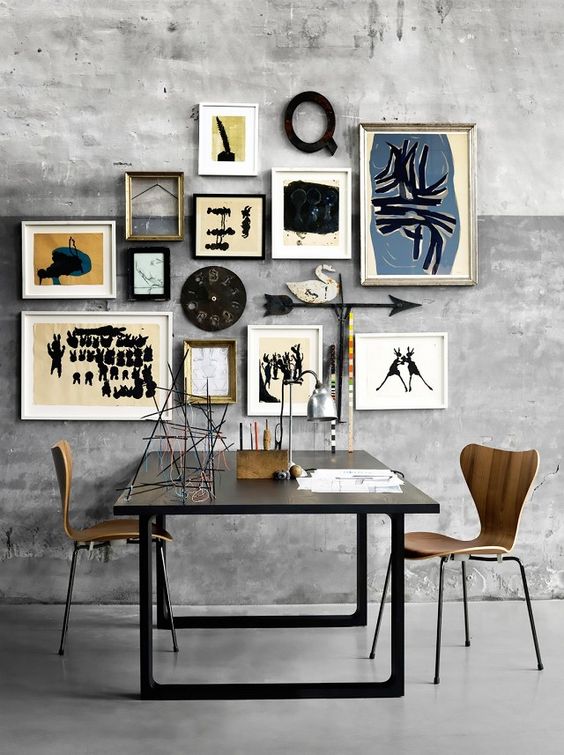
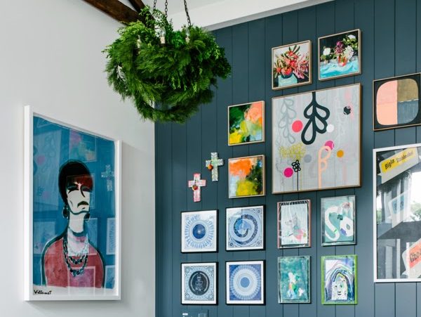
Some of the most effective wall treatments are elaborately constructed, using varied styles and sizes. Think of the New York style loft with one wall absolutely teeming with starkly differing images, from photos to original paintings, creating a vibrant atmosphere and somehow drawing cohesion from mayhem. It’s a lot of fun to create a busier feature wall, and an individual, couple or family’s entire life can be expressed by breaking all the rules and combining any type of mounted art. In most cases it can all work in unison; it’s a matter of finding the right layout and order.
Whether you opt for a subtle approach or create walls that are just as creative as the works mounted on them, there have never been so many techniques and so few rules. As long as you compliment your interior design style, the many materials we’ve featured show how much variety now exists for homeowners who are looking to go one step further to express themselves and reveal their personal aesthetic.

