Pantone has become the world-renowned leader on colour, and produces cutting-edge technology for the selection of colour across a multitude of industries. They provide an international language for colour communication between designers, manufacturers, retailers and clients.
Creative communities around the world turn to Pantone for technical and inspirational colour tools, and every year we wait eagerly for the release of Pantone’s Colour of the Year.
What is the PANTONE 2017 Color of the Year?
It’s a symbolic colour selection; a colour that summarises the current climate of our global culture, its emotion and frame of mind.
Pantone has introduced Greenery (Pantone 15-0343) as it’s 2017 hero.
“Greenery bursts forth in 2017 to provide us with the reassurance we yearn for amid a tumultuous social and political environment,” says Leatrice Eisemen, Executive Director of Pantone Colour Institute. “Satisfying our growing desire to rejuvenate and revitalise, Greenery symbolises the reconnection we seek with nature, one another and a larger purpose.”
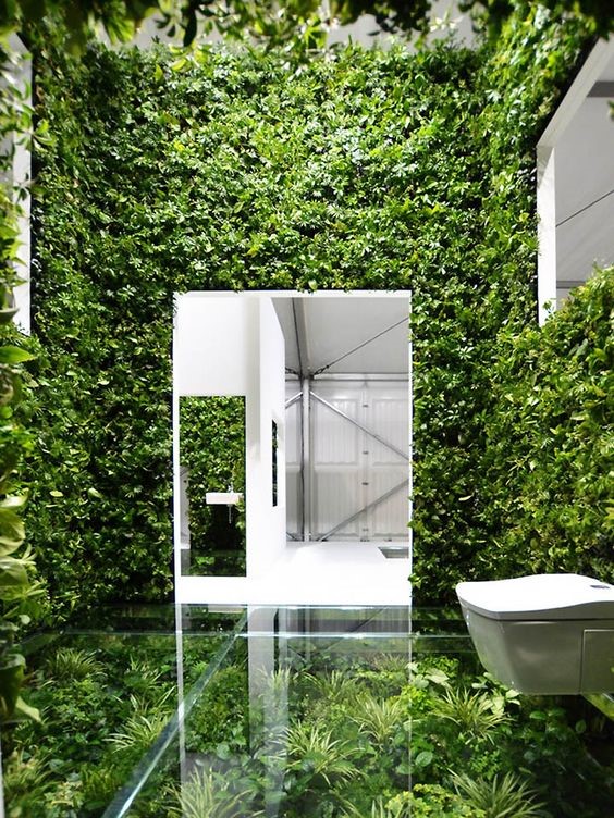
Image Reference
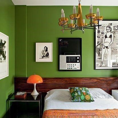
Image Reference
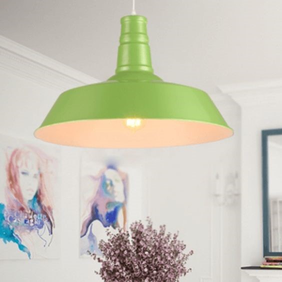
Image Reference
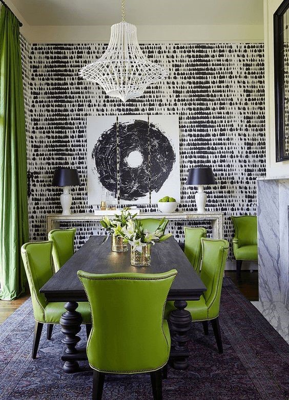
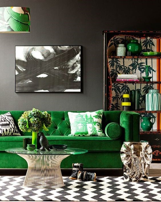
Pantone 2017 names Greenery “Nature’s Neutral”. It can pair with most colours and flourish. Below are some combinations that we’ll certainly see across the the various design industries this year: fashion, interiors, graphics and beauty, to name a few.
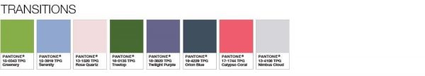
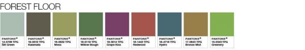
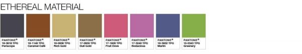
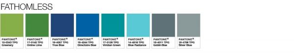

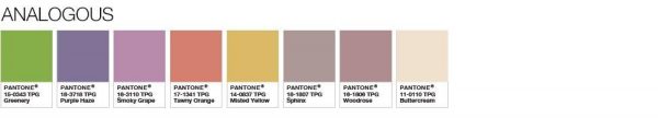


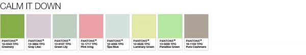
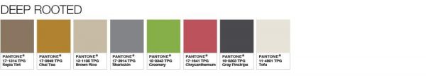
Image Reference
Bring passion and vitality to your designs with this truly trans-seasonal colour. We’re all for going green!
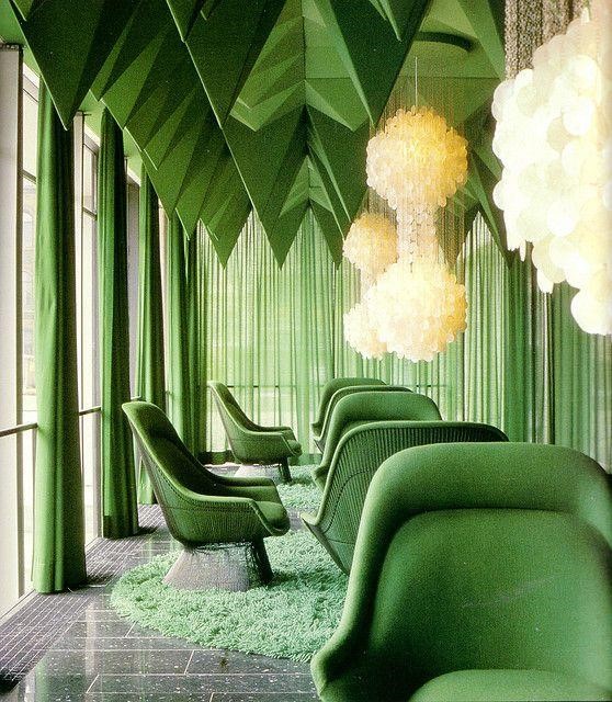
Image Reference
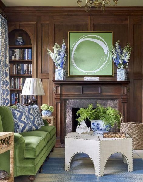
Image Reference