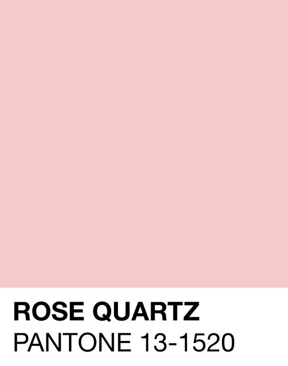
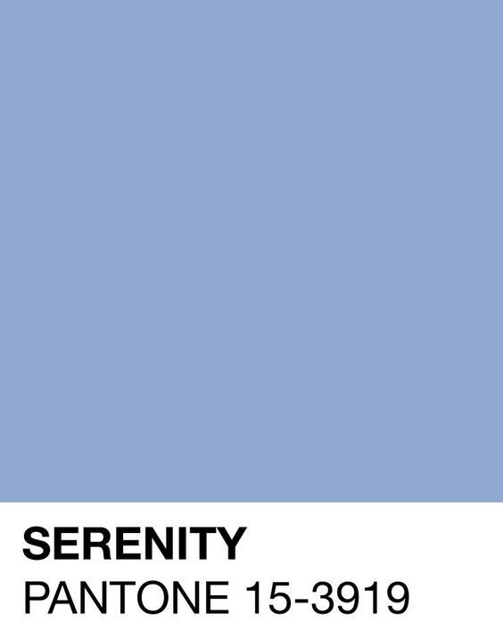
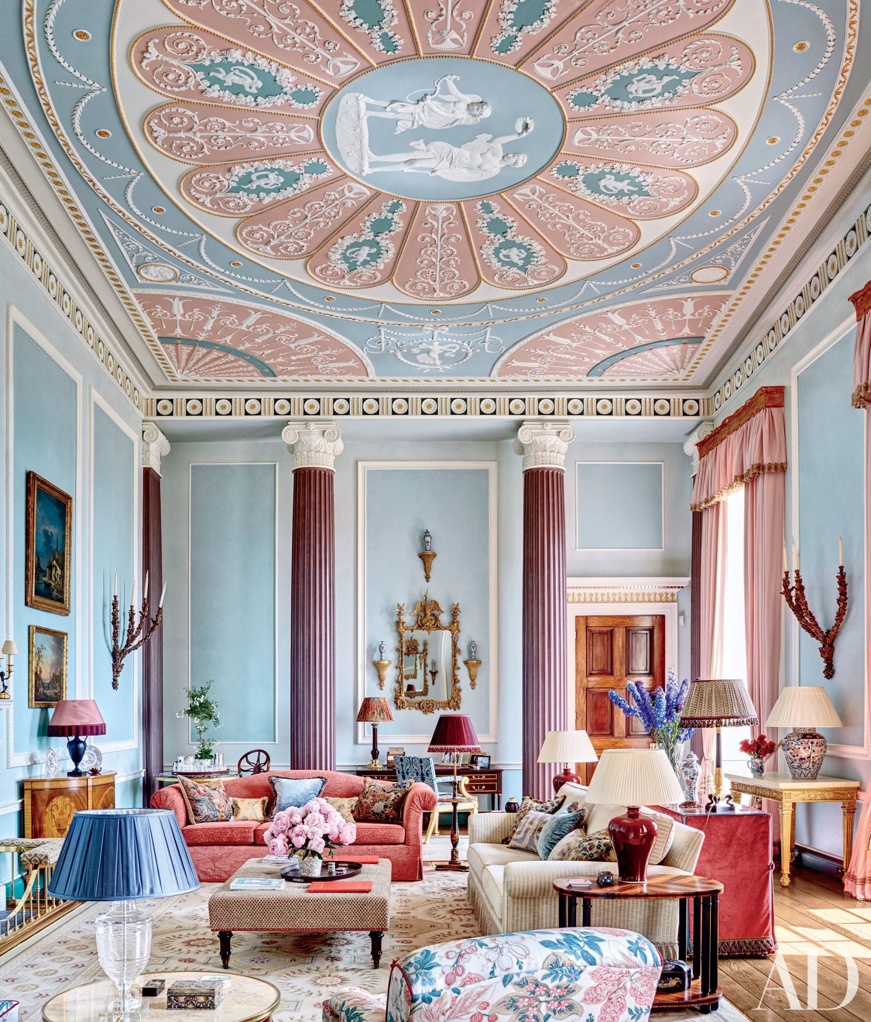
Designing with Pantone 2016 colours- Serenity and Rose quartz Pantone’s colour of the year is remarkable for a number of reasons, the most obvious being the fact that, for the first time, two hues have been selected: Serenity and Rose quartz.
This makes sense to any designer, of course, because the selection of colour combinations is probably one of the most wonderfully agonising processes when planning interiors. While environments or personalities may inspire us, triggering design epiphanies, it’s a critical decision never made without careful and long deliberation. Thankfully Pantone’s unprecedented announcement offers a ready-made palette that achieves unusual duality: a visually bold statement that also has an undeniably calming effect.
“Calming tones”
Let’s face it; our lives have become increasingly frantic. Thanks to social media, even our private lives can seem demanding at times. The arrival of these brave yet soothing tones is a tonic. This combination also continues to break down stigmas associated with gender. Since the 80s, similar combinations have helped men use fashion to rebel against tradition. These harmonious tones have a magical quality that allows them to sit well with most colours and appear natural in almost any landscape.
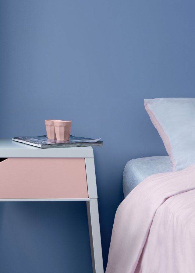
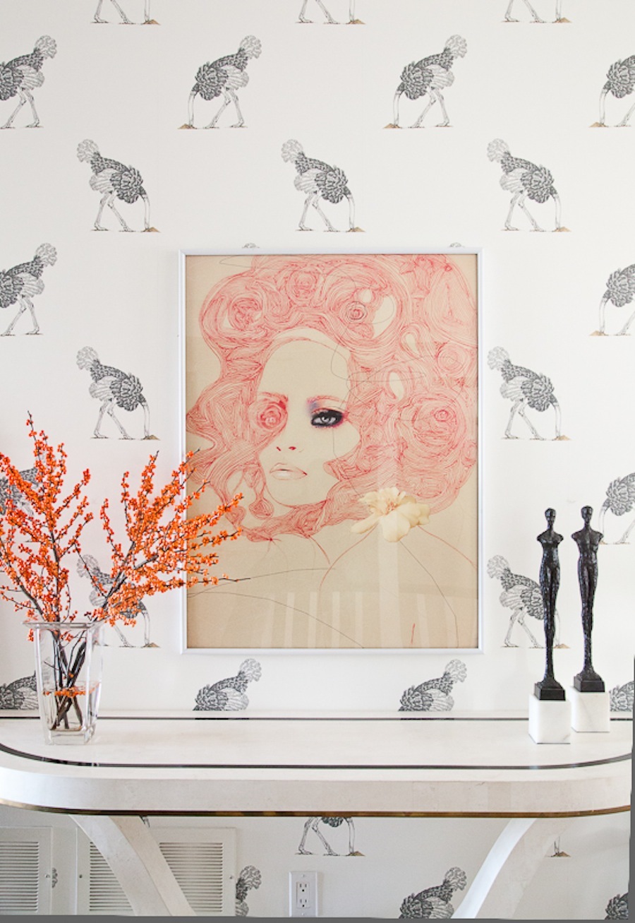
“Feminine touch”
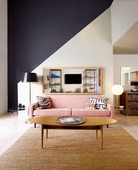
“Sharper edges with a masculine accent”
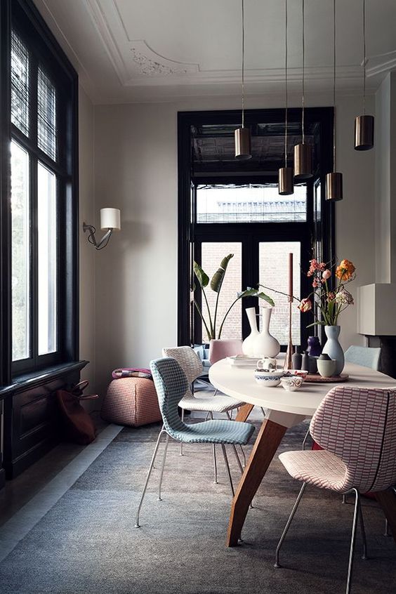
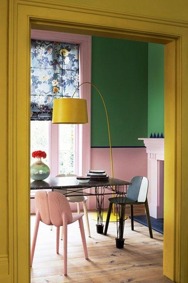
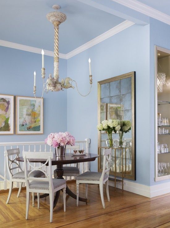
Each established interior design style gains a unique effect. Serenity and Rose quartz offer an obvious opportunity for Modern in the form of bold colour blocking while Modern Eclectic will see these tones paired with metallics, rich fig and green tones.
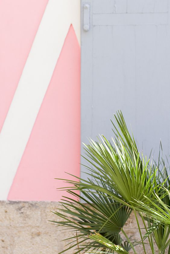
“Vivid colour blocking”
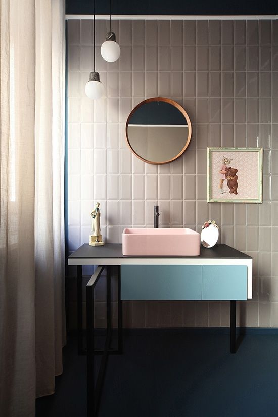
“A modern twist”
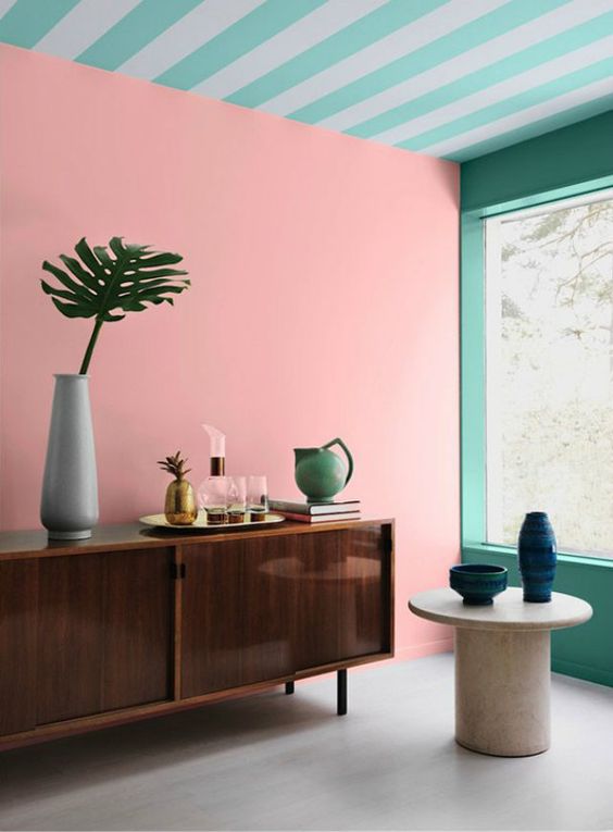
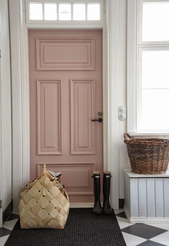
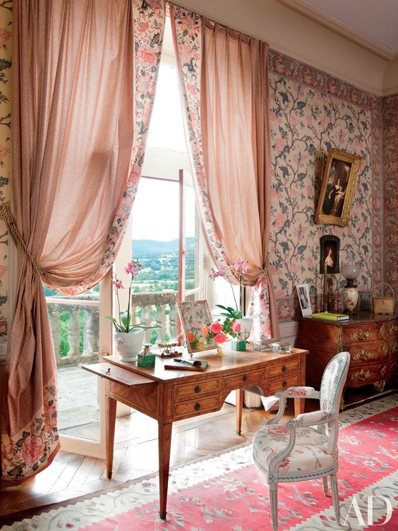
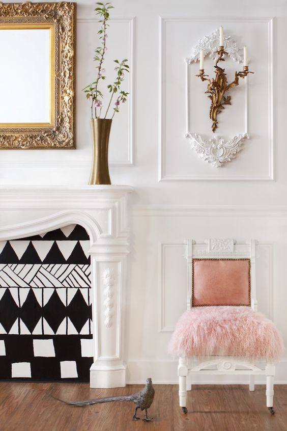
Traditional styles will see a flirtatious use of pattern and colour. The impact of this serene pairing of colours can easily be softened or amplified when combined with complimenting tones like black, neutrals or yellows, and they have the unusual distinction of perfectly suiting sharp block shapes or fluid, loose fabrics.
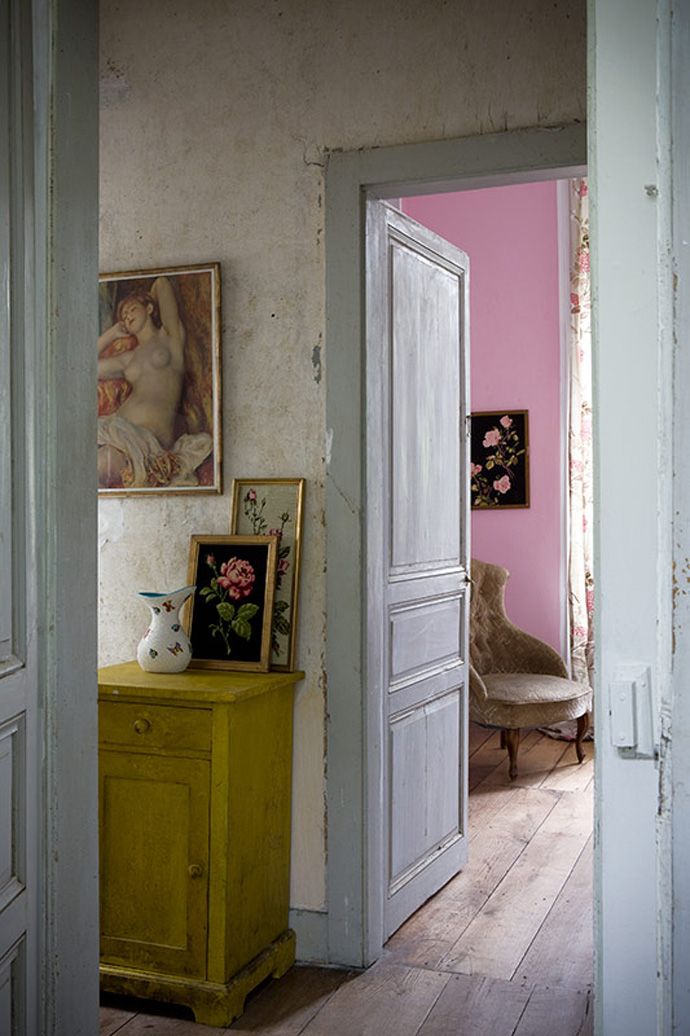
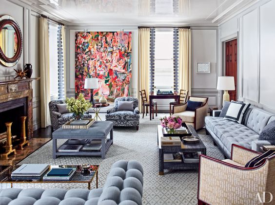
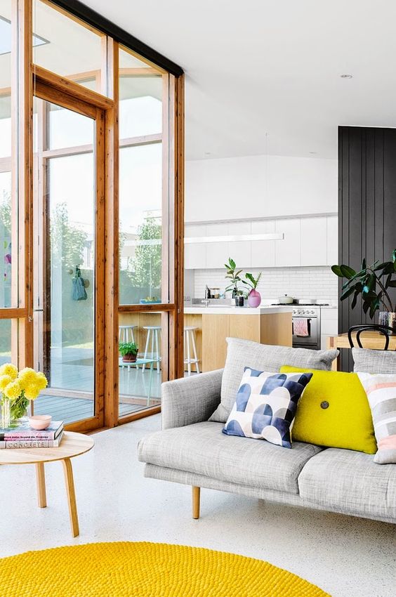
As examples clearly illustrate, whether you limit a space to these colour(s) of the year or adventurously add bold but complimenting hues, Pantone’s inspired choice seems to be at home (pardon the pun) in most settings.
“Room to be you”
Designbx “Designing with Pantones 2016 colours- Rose quartz and Serenity” designbx.com