From the moment we picked up our crayons as toddlers and began to imitate nature, our connection to colour has been enduring. The feelings each hue evokes are permanently etched on our subconscious minds, and whether wittingly or automatically, we use these preferences in any environment we control.
In our home or office space, colour is crucial, whether we require motivation, inspiration or calm, so let’s focus on the use of hues in interior design to boost mood and atmosphere.
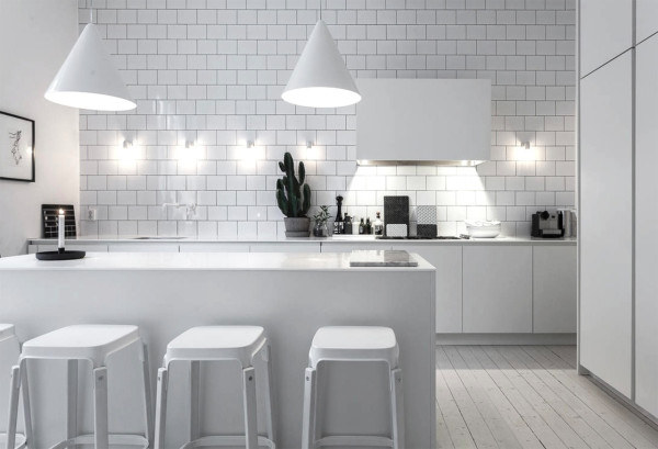
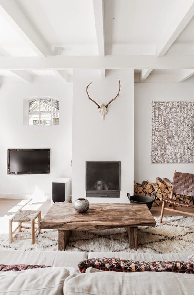
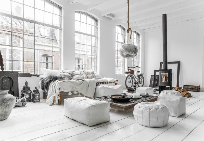
White
Representing clarity, peacefulness and cleanliness, white is usually the primary palette in bathrooms. As a blank canvas, white can also promote creativity and inspiration for children.
However when used in excess, white can be stale and remove vivacity from a room. Using white as a base with pops of contrasting colours and natural textures is a great way to change the mood of a room.
Natural materials like wood, marble and plants will bring warmth and comfort to a white space while maintaining a neutral palette.
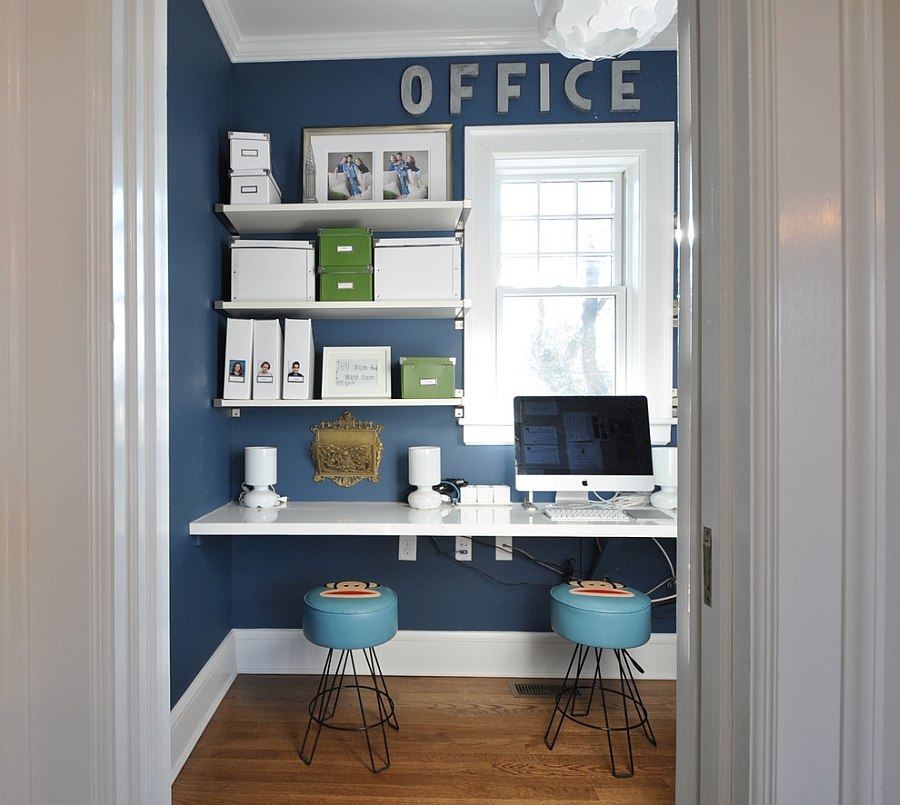
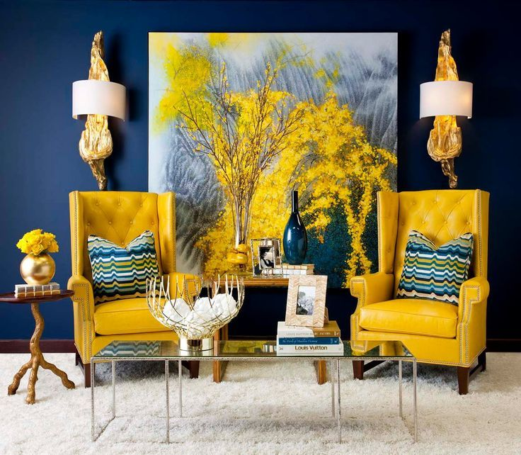
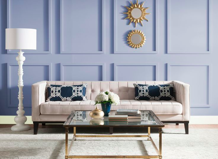
Blue
Evoking calmness and tranquillity, blue is often the top choice for workspaces. It stimulates focus and productivity. It may be a blue wall, touches of blue in interior furnishings like chairs, carpet, tiles or light fixtures, or used within branding elements logos and marketing media.
Representing the sea and the sky, blue also brings us to the solitude of the coastline, inspiring relaxation and reflection, so can also work well in a light hue within a bathroom space.
Dark blue on mass can be cold so is best mixed with a range of blue hues or as a focus colour amongst a lighter colour scheme.

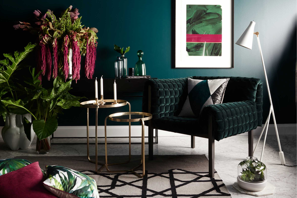
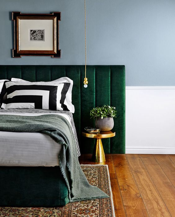
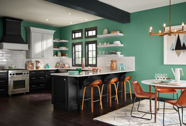
Green
Usually associated with health and well being, green can be a good colour to use in bedrooms, bathrooms and kitchens. It’s considered the easiest colour for the human eye to process and therefore not overly stimulating. For this reason, using a light green hue in a nursery is a great gender-neutral palette to work with.
Dark green is also associated with wealth and prosperity, a strong and confident choice. When paired with blue it remains striking but with a calm overtone. Introducing green colours into a space using plants is an excellent way to bring the outdoors in, and freshen the air of your interiors.
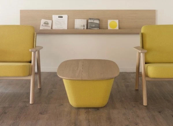
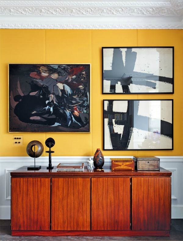
Yellow
Bright and sunny, yellow is fun and uplifting. Using highlights of yellow in spaces like the kitchen, dining room and living areas promotes positive energy and a social atmosphere.
For a more subtle approach, opt for a muted or deeper yellow. This is commonly used in a bedroom space to enhance warmth, comfort and security.
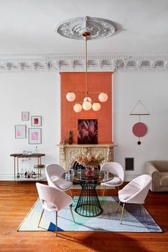
Orange
As a colour of fire, orange makes us feel warm and alive. These sensations stimulate our brains with a boost of oxygen and can result in sociability and increased appetite. Orange is therefore a great colour to use in spaces where entertaining happens like dining areas or outdoor settings.
As a block colour, orange can become quite overwhelming so is best used sparingly and alongside contrasting colours like green, or complimentary colours like yellow or red.
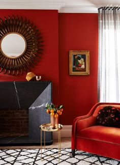
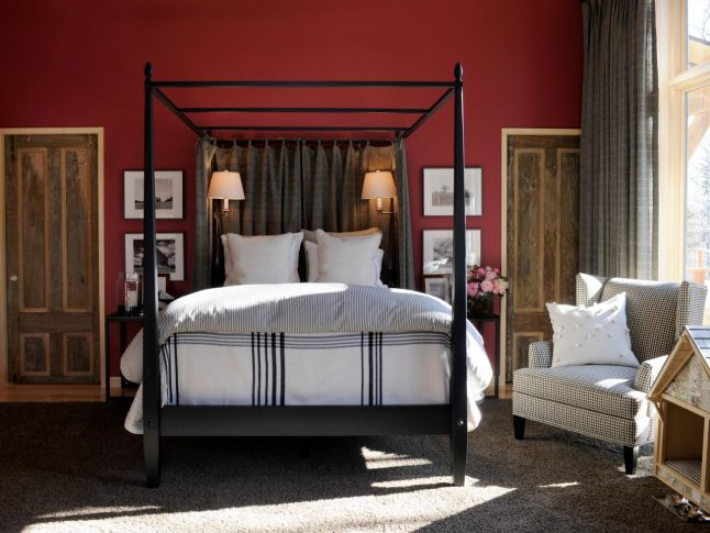
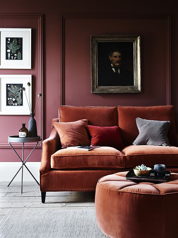
Red
Most commonly known as the dynamic colour of passion, red excites and stimulates the eye. It’s a powerful colour that is associated with love and sensuality.
As a pure hue, it can create anxiety and stress so it’s important that it’s knocked back and earthy in tone when used in bedroom spaces or areas meant for relaxing and socialising.
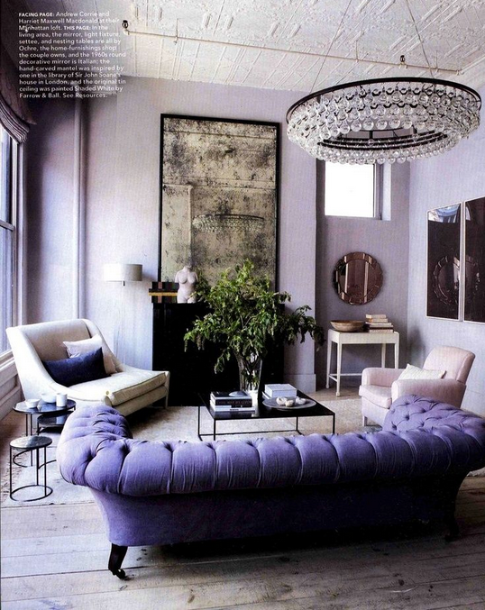
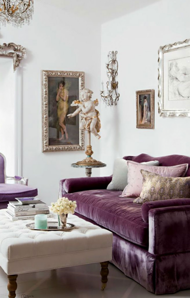
Purple
Often used in realms of spirituality, purple is the colour of calmness and reflection. Purple also has been affiliated with nobility and royalty and can give the impression of abundance and luxury. As purple is a secondary colour, combining blue and red (depending on the hue of purple used) can dramatically change the feel of a space.
Light purples (blue based) can be calming and intimate, most effectively used in bedrooms and nurseries. Dark purples (red based) are much more intense, evoking prosperity and the illusion of expensive taste and luxury. However when used in excess, dark purple can create a heavy and negative vibe, so balance of hue and tone is crucial to maintain a positive sensation.
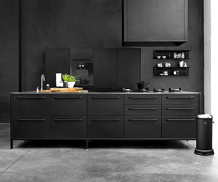
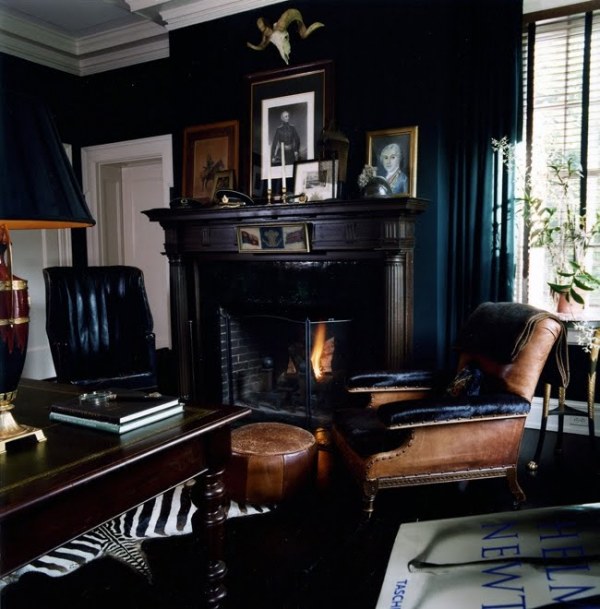
Black
Often used best as an accent colour, black represents sophistication and power. Having a strong association to status, it can be effective in office spaces. When used in living rooms, bedrooms, kitchens or bathrooms, it does emit luxury but can be off-putting and mournful if used in heavy proportions.
As you can see, some colours are more adaptable, easily applied to a number spaces and safer to use as base or block colours. Others have a potency that can bring a space to life when used with subtlety, but can be dangerous when overused.
When it comes to deciding on a suitable colour scheme for your space, use your instinct and go for colours that you love to ensure that the space represents you and your personality. But use our guide to make sure your choices don’t result in interiors that contradict the intended mood.
Every hue on the colour wheel evokes mood and emotion, so never underestimate the positive and negative impacts of colour in interior design.
Kerena Berry is co-founder and Head of Interior Design at Designbx.com, Australia’s first complete online interior design solution, home to over 12,000 home décor products, and a personal shopper service that coordinates the supply and delivery of furniture and
homewares.