Hosting Christmas this year? Let’s ensure not only a delicious family feast, but a beautiful and colourful one as well! When thinking of Christmas palettes, we typically think of traditional colours like reds and greens, but with Australians embracing their own personal style and reflecting that in their home, why not sing to the same tune for your Christmas theme. Here are five of our favourite colour schemes that will be sure to strike a cord with your own personal style.
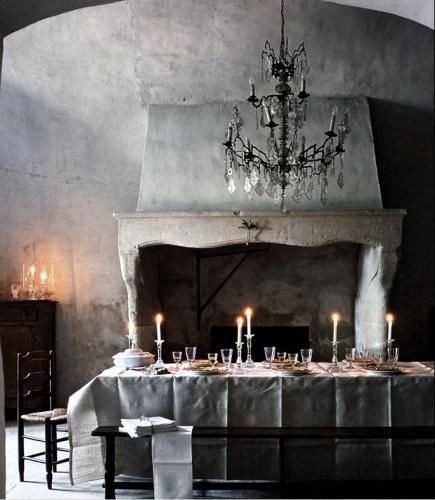
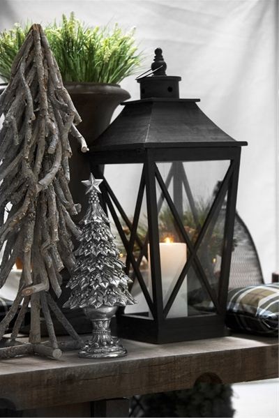
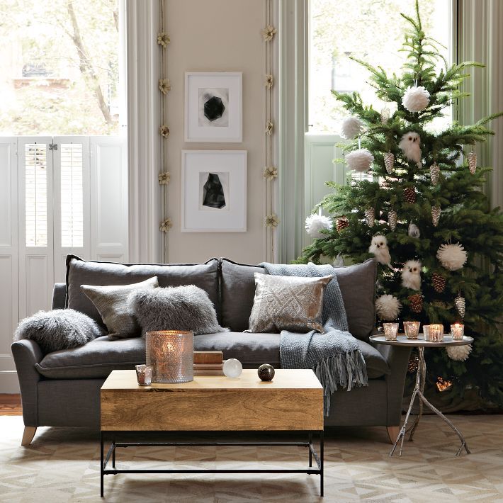
All in Grey
A muted yet fresh feel for Christmas. Grey has become very popular as it forms a neutral backdrop for any interior style. The tone can range from a soft pale grey to a dark warm charcoal. This would work within an industrial, coastal, scandi and even traditional interior. Stand out elements include; oversized linen ribbon bows on the tree (be bold and opt for a white tree over the traditional green), dark grey linen tablecloths overlaid with hessian table runners, eclectic tableware, bowls and glasses paired with wooden chopping boards as serving plates. Be sure to play with texture and tone.

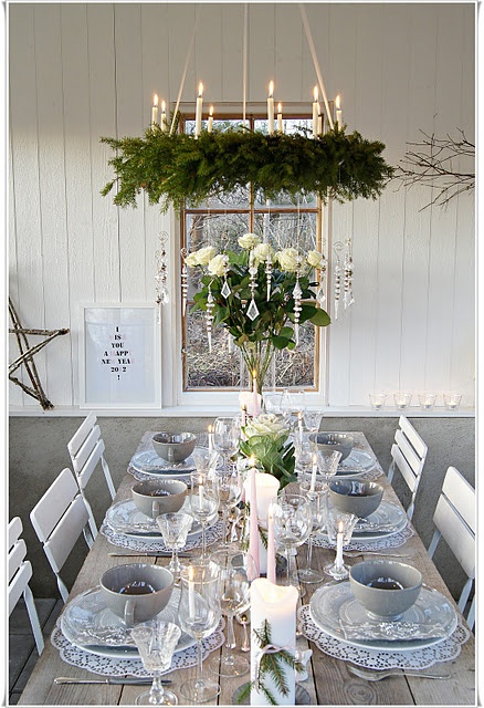

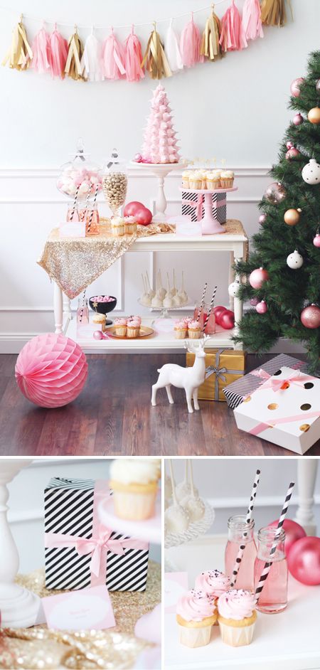
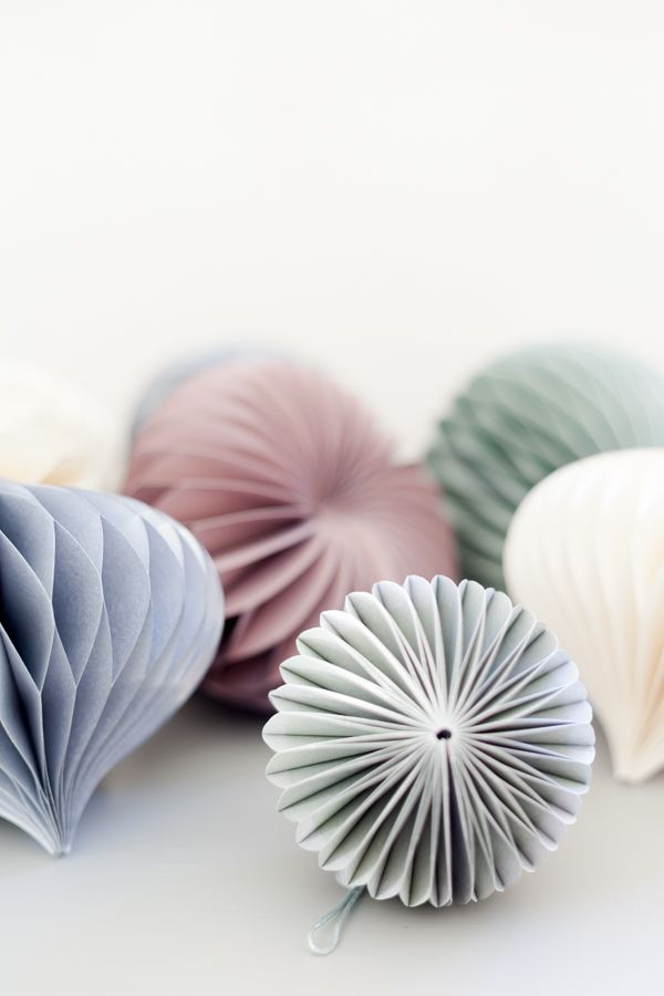
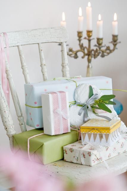
Pastels
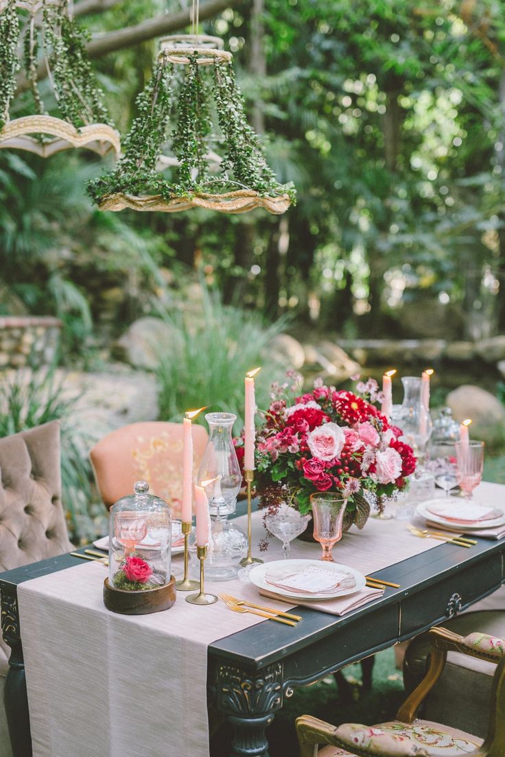
A pop of pastel…fresh, fun and stylish. Pairing soft pinks, corals and creams with a touch of gold gives a feminine and modern feel. Think modern shapes – diamonds, hexagons or layer square and circles to create contrast. Play with your finishes using paper pom poms, glittery gold balls, and fine delicate cotton ribbons on the tree. Pastels also pair beautifully with intricate glass finishes like glass cut decorations, chandeliers as the table centerpiece, Diamante encrusted candle and napkin holders – whitewash timber and concrete surface could be perfect to complete this look. Be adventurous with wrapping paper. Use hessian fabrics and knot like a sack. Use old book pages and accent with a big pastel bow, or buy plain boxes and cover in glitter for some wow factor!
What a great way to bring the table to life. Focus on the ceiling, more space for food! 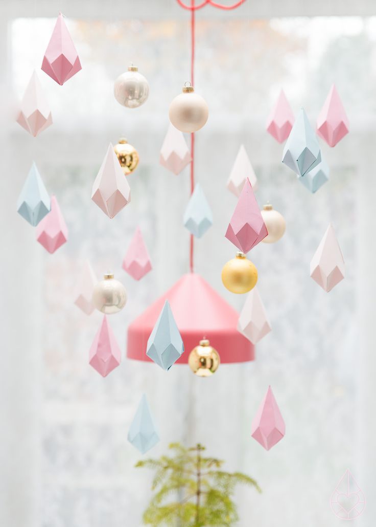
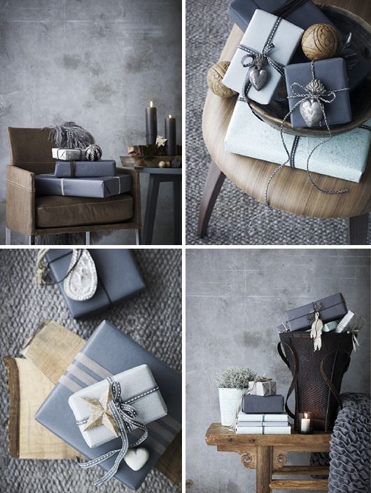
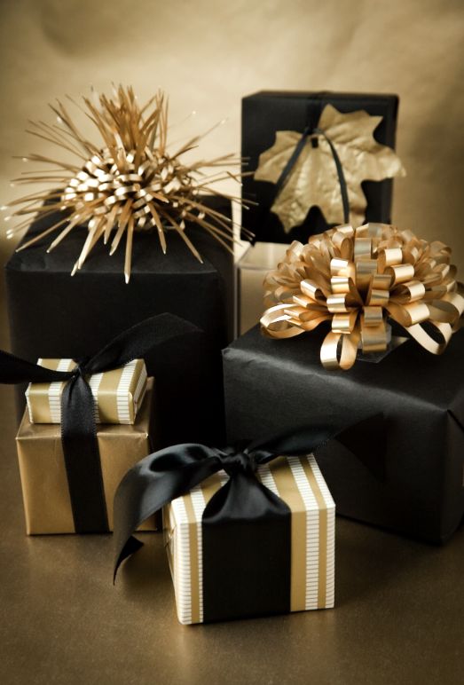
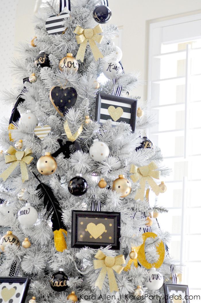
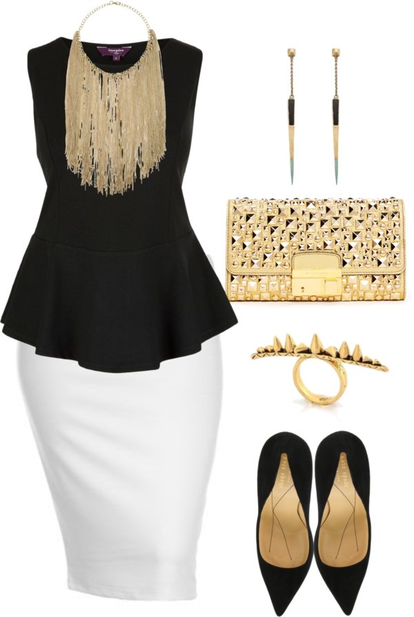
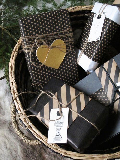
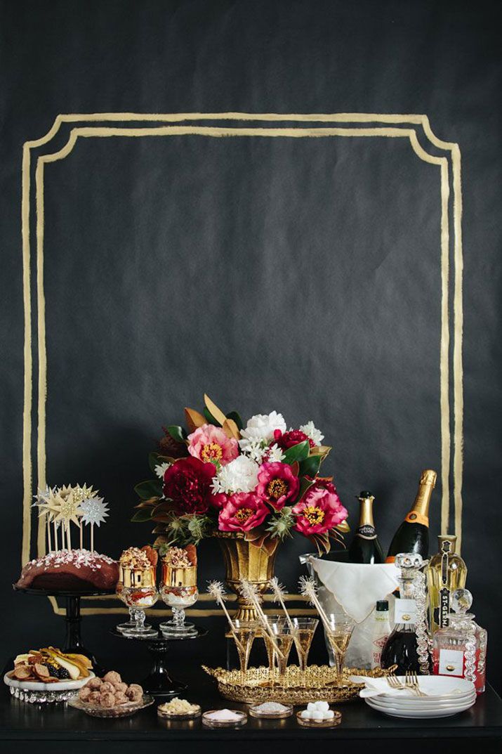
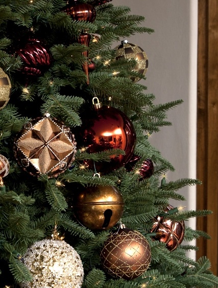
Black, White and Gold
Give the table a dose of holiday glam by pairing black and gold together. This is a wow colour combination but equally elegant and festive. Introduce black and white combinations through patterns – stripes, tartan,and polka dots. Mix your shades of gold – champagne through to rich gold. Black, especially high gloss Christmas ornaments are a fantastic choice for a white Christmas tree. Introduce natural twine around your wrapping paper to give a more scandi rather than luxe feel. Gold spray painted leaves make a stunning runner down the centre of the table. For evening ambience add a piece of mirror on top and adorn with tea light candles.
Dress to impress…
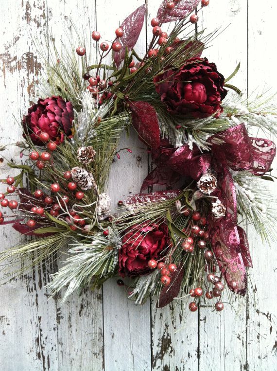
Burgundy, Green and Gold
Tradition still has its place, and what better way to bring it to life than with this rich opulent palette. Opt to replace reds with a rich burgundy this season. Burgundy has swooped the design industry this year it’s warm, inviting and intriguing. This sensual colour will work best with generous amounts of natural foliage or sitting amongst silks, velvets and lace with warm lighting.
A rich burgundy cotton tablecloth layered with the same toned lace cloth will add immediate warmth and texture. Use an abundance of pine greenery down the centre littered with intimate little gold touches and candles. Gold cutlery and dark green dinnerware equals perfection! Gifts are all about repetition of these colours. Wrap in butcher paper and then burgundy cellophane for a wet look wrap. Layer a thick burgundy silk ribbon around and complete with a sprig of rosemary inside your bow
The perfect outfit for the day…dapper!

Let the flowers do the talking
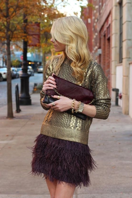
And for the ladies…
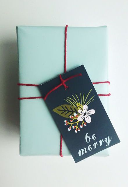
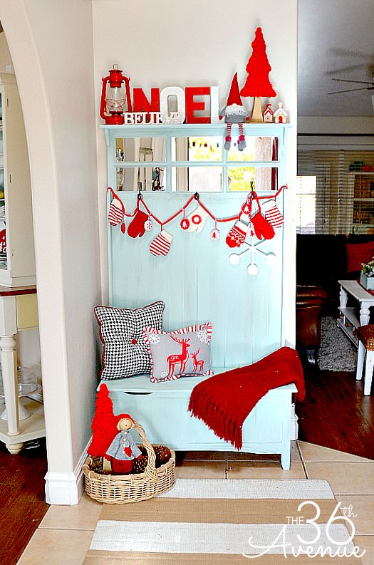
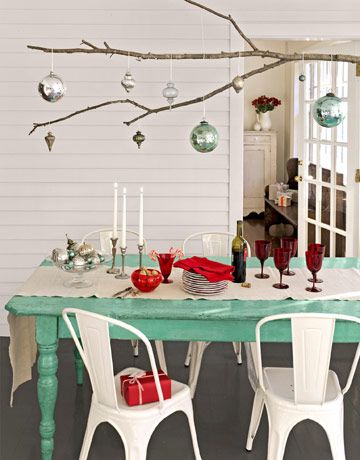
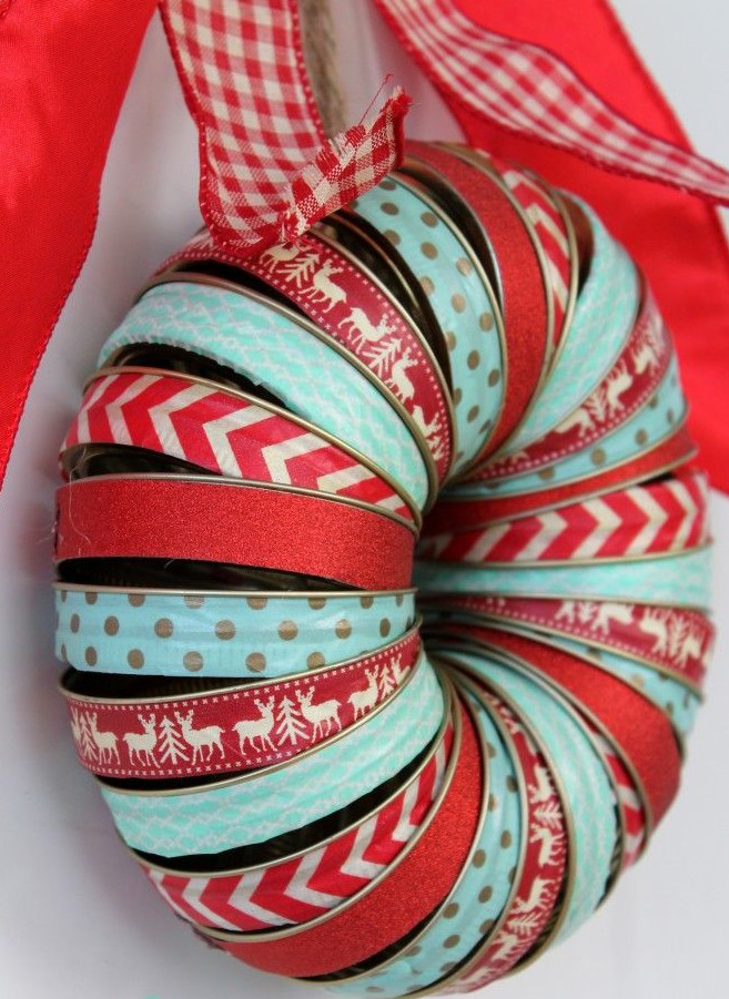
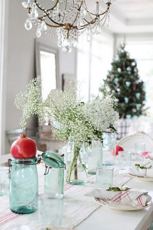
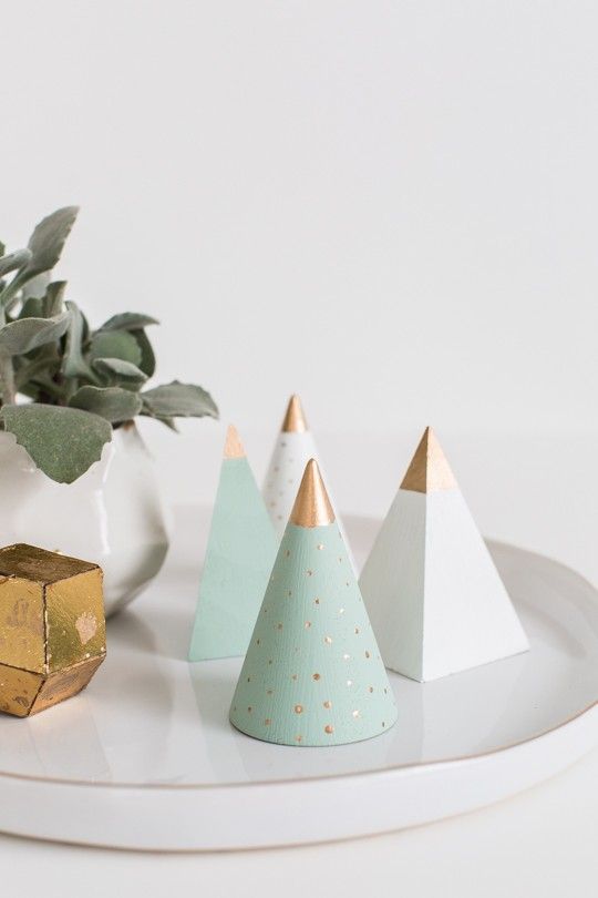
Mint and Red
This colour combination puts a new spin on the classic red by using a cool shade of mint. Mint and red are contrasting colours that work well together to give a summer feel. Maintain traditional patterns and motifs like reindeers, gingham, spots and stripes. Pair with white wash or bleached timbers, drift wood and raw linens to give that Scandi look. Opt for the revival of the metal dinnerware to give the table a more relaxed feel. Fill a tin red bucket with nude branches from the garden or a local walk. Tie little cotton mint ribbons on all the branches for a simple yet striking table centerpiece.